
March 9, 2024 · 5 min read
WordCamp Asia 2024 in Taipei: Accessibility Is Interaction Design at Event Scale
A field note from WordCamp Asia 2024 in Taipei on how conferences, captions, venue design, food, movement, and open-source community become interaction design.
A WordPress conference is also a designed environment
WordCamp Asia 2024 took place from March 7 to 9, 2024 at Taipei International Convention Center. The official site framed it as a flagship WordPress gathering with roughly 2,000 participants, 70+ countries, 50+ speakers, and 40+ sponsors. Those numbers matter, but they are not the most interesting design fact.
The more useful observation is that a conference this size behaves like a temporary product. It has onboarding, navigation, language support, trust signals, error recovery, social rituals, content hierarchy, and moments where people either feel included or quietly drop out.
I attended with a product designer's eye, which means I kept noticing the parts that are easy to treat as logistics: how people find a room, how subtitles sit under a slide, how food becomes a cultural interface, how volunteers reduce uncertainty, and how a city like Taipei shapes the emotional tone around the event.
Accessibility appeared in the infrastructure, not only the rhetoric
The official accessibility notes for WordCamp Asia described barrier-free ramp access at the venue, wheelchair rental, charging stations for mobile phones and electric wheelchairs, priority seating, ramps for stages, wide aisles, a quiet room, a family room, lactation support, prayer rooms, health guidance, and an information desk for assistance.
That list reads like event operations, but it is interaction design. Each item answers a question a person might otherwise have to carry alone: Can I enter? Can I sit where I can participate? Can I charge the device I depend on? Can I step away without leaving the event? Can I ask for help without making a scene?
Good accessibility reduces the amount of private negotiation required to be present. It turns participation from a personal workaround into a property of the environment.
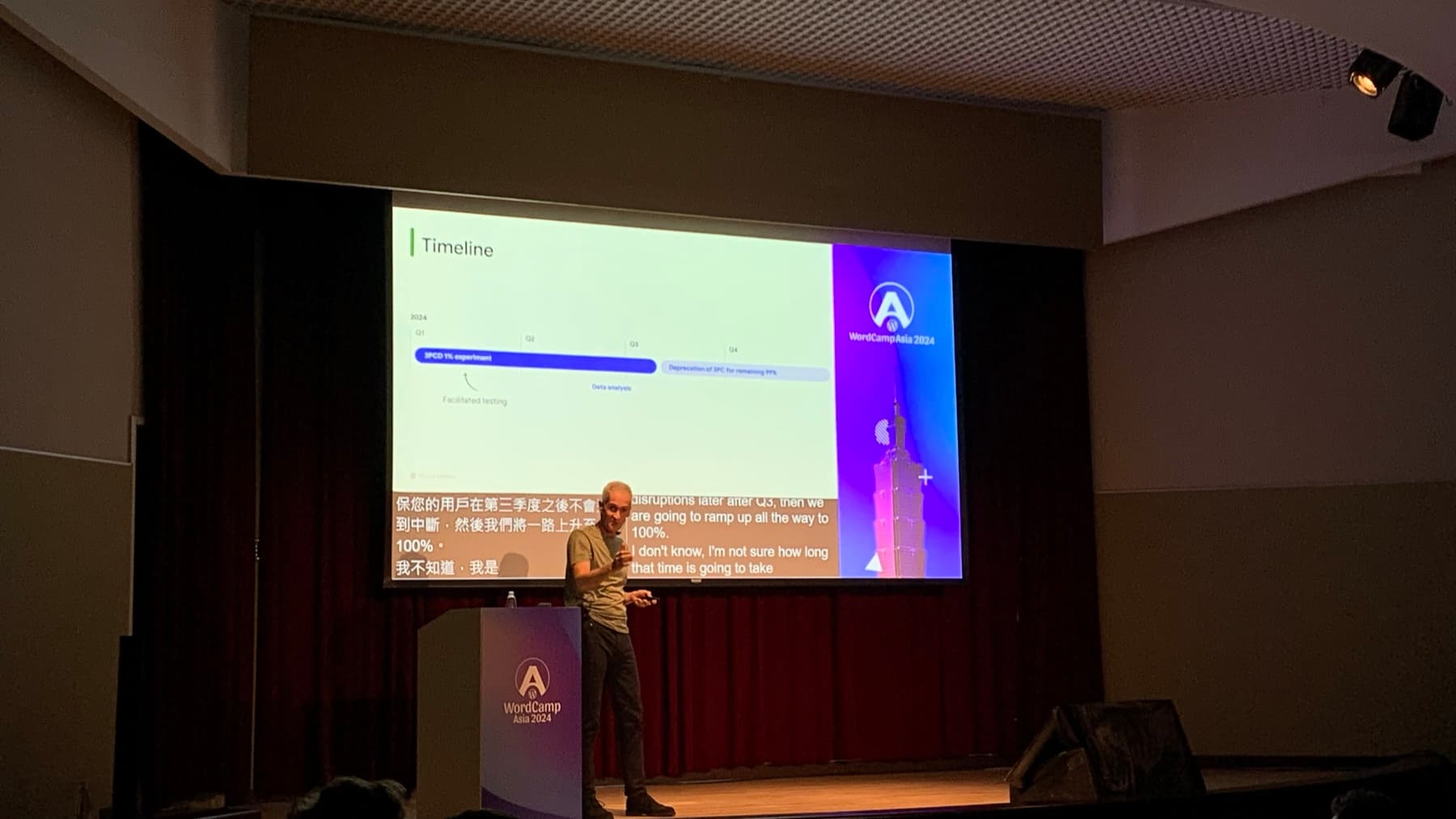
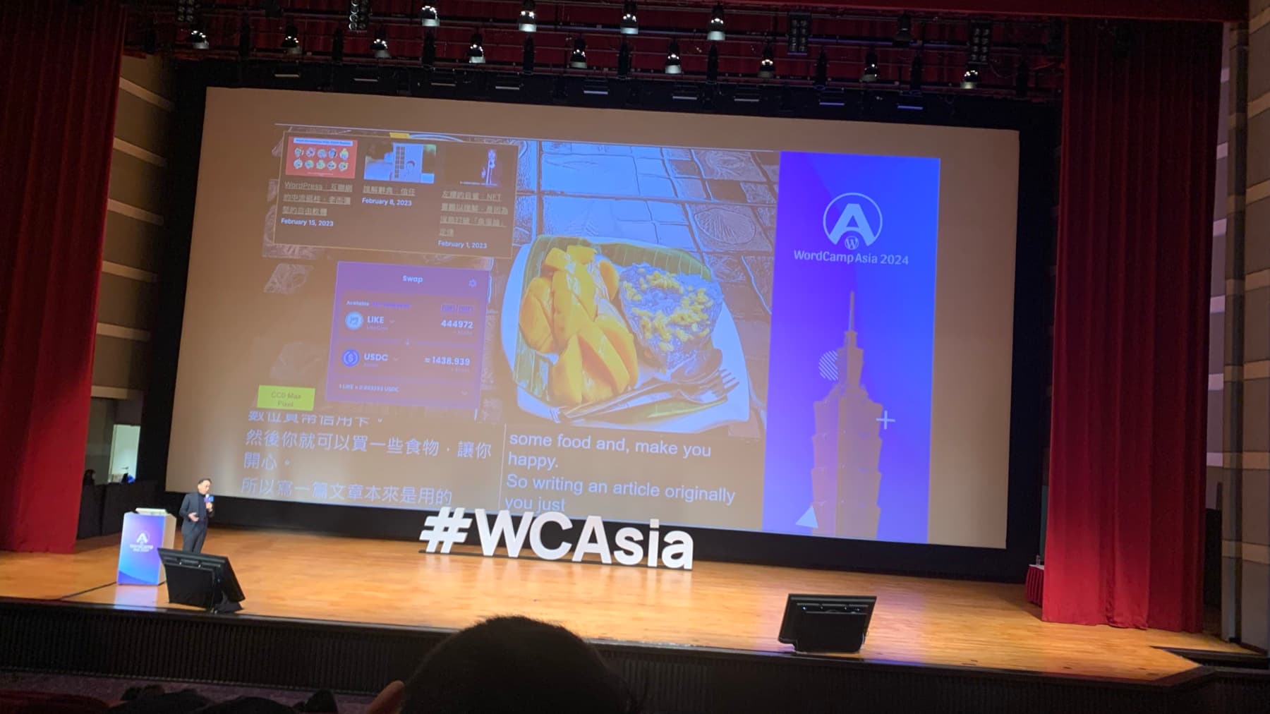
Captions made the interface bilingual and time-based
The official programme said WordCamp Asia used Wordly captioning, with real-time captions available in 57 languages from a phone or laptop, in addition to captions displayed on stage. In the room, that changed the feel of the talks. The slide, speaker, translated text, and audience attention all had to share one visual field.
This is a useful reminder for digital products. Accessibility is not a plugin added after the main experience is finished. It competes for space, timing, contrast, hierarchy, and cognitive bandwidth. If captions are too small, late, hidden, or visually subordinate, the access feature exists but the interaction still fails.
At WordCamp Asia, the best moments were not when the caption layer disappeared. They were when it became ordinary enough that the audience could focus on the talk instead of on the effort required to follow it.
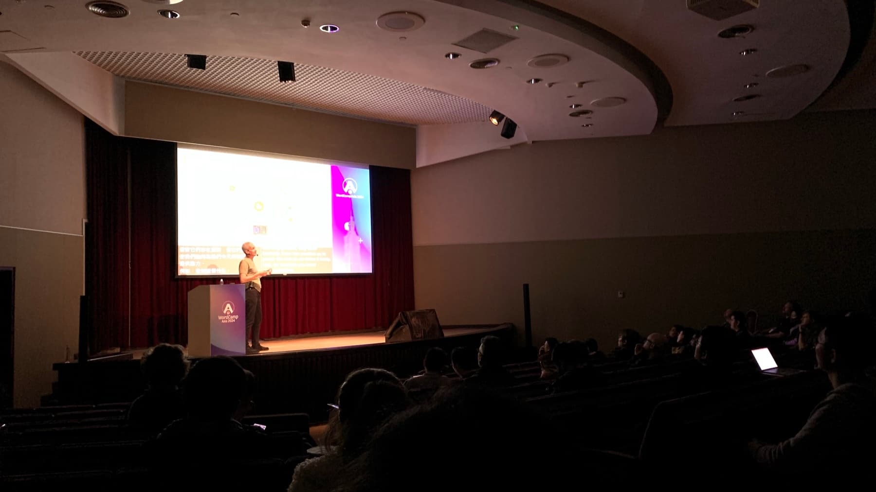
Two short clips from the room
The videos are small field recordings rather than polished conference footage. That is why they are useful. They show the real scale of the room, the distance from seat to screen, the visual weight of captions, and the way a presenter becomes part of the interface.
A video from an event like this is not only documentation of content. It is evidence of legibility under imperfect conditions: lighting, angle, audio, heads in front, moving captions, and a person deciding where to look.
Video note
The clip shows a speaker standing near the podium while a large slide reads Challenge yourself. Chinese and English captions are projected across the bottom of the screen.
The useful design detail is the competition for attention: the audience must read the slide, follow the speaker, and use the captions without losing the thread.
Video note
The clip shows a speaker explaining a slide that reads Cookie = State. Bilingual captions are visible below the slide while the presenter gestures beside the podium.
For the article, the clip matters less as a complete lecture excerpt and more as a record of how technical explanation is distributed across several media at once.
Open source has a social interface
WordPress is often discussed as software, market share, ecosystem, or publishing infrastructure. At WordCamp, it is also a social protocol. People arrive with different jobs, languages, levels of confidence, and relationships to the project. The event has to make contribution feel possible without pretending that everyone enters with the same context.
Contributor Day on March 7, followed by two conference days, gave the event a useful shape: first participation, then presentations, then hallway interpretation. That rhythm matters. A community is not only what people hear from a stage. It is what they are invited to do, who explains the next step, and whether the room makes newcomers feel legitimate.
For interaction design, this is the difference between a product that has users and a product that has members. Users need task completion. Members also need orientation, belonging, roles, history, and a way to become more capable over time.
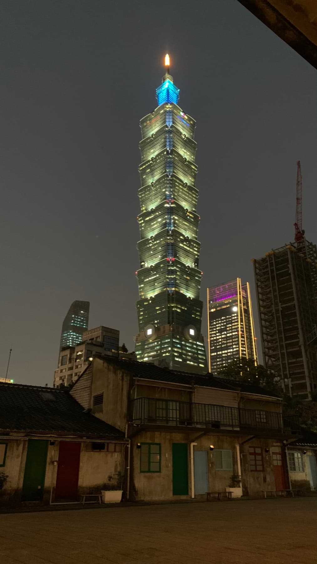
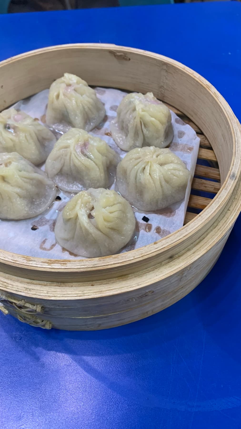
Food and weather were part of the experience
The conference did not end at the venue doors. Taipei's food, rain, streets, transit habits, and dense visual culture formed the rest of the interface. A bowl of xiao long bao or a wet walk between places is not separate from the conference memory. It changes how the work feels in the body.
This matters when designing international events and global products. Localization is not only language. It is the practical texture of being somewhere: what people eat, how they move, what signs they trust, when they need shelter, and what kinds of help feel natural to ask for.
WordCamp Asia's official travel material pointed attendees toward transportation, food, tours, and useful apps. That is good service design. It acknowledges that the event journey begins before registration and continues after the last talk.

What product teams can borrow
The practical lesson from WordCamp Asia 2024 is that interaction design expands when many people, languages, devices, rooms, and expectations meet in one place. The interface is not only the website that sells the ticket or the slide deck on stage. It is the whole chain of participation.
For digital teams, that means accessibility must be designed as a system: semantic structure, captions, readable media, keyboard paths, language support, help points, recovery states, quiet modes, device constraints, and respectful defaults. For event teams, it means the physical venue, volunteer scripts, signage, food, streaming, captions, and room layouts all belong to the same user journey.
The best version of WordPress has always been larger than publishing software. It is an argument that more people should be able to make things on the web. WordCamp Asia in Taipei made that argument spatial. It showed that participation is not created by saying a community is open. Participation is designed, maintained, translated, captioned, signposted, fed, and made reachable.
Photo notes
Evidence from the floor
Recommended reading
Read next
4 min read
Inside China's Beauty Innovation Stack
Field observations from CiE 2026 in Hangzhou on how Chinese beauty brands connect research, packaging, manufacturing, commerce, and consumer experience.
2 min read
One Website, Four Kinds of Quality: Lessons From Viirus Theatre
A case-study view of web quality across accessibility, performance, privacy, and environmental impact.
2 min read
There Is No Fixed Interface Anymore
A practical argument for generative UI with stable rules, accessible fallbacks, and meaningful user control.