HAAM · Design systems
Built to last. Through every season.
HAAM takes its cue from a hammer: a useful tool for making durable things. The structure is grounded. Summer, winter, sunshine and moonlight are the outfits it wears as the seasons change.
The durable core
Make something worth keeping.
Durability lives in clear information, dependable interactions, accessible journeys and systems people can understand and maintain. A new visual identity, a new season or a new technology should be something the product can absorb while preserving what people rely on. Keeping it useful takes continued care.
The browser is the canonical first surface today. Figma libraries and Storybook mirrors are explicitly shown as the next artifact layer where they do not exist yet.
Quality contract
100 is the target. Evidence is the test.
Performance, accessibility, Best Practices and SEO each have a 100/100 Lighthouse target on mobile and desktop. Three runs per page keep a lucky result from becoming the headline. The dated report shows the actual results, warnings and work still to do.
Google PageSpeed Insights ·
Default English homepage /: one Google-run audit per device. The three-run site sample is reported separately.
- Mobile · /: 100 / 100 / 100 / 100
- Desktop · /: 100 / 100 / 100 / 100
Performance / 100 · Accessibility / 100 · Best practices / 100 · SEO / 100
Download audit data ↗Target not yet verified across the sampled pages
Latest production evidence: .
Security is checked separately: browser policies, dependency advisories and application review. Automated scores do not certify security or accessibility conformance.
Read the website quality report ↗Structure and expression
A grounded core. An outfit for each season.
What holds
The durable core is the product’s purpose and the relationships that make it understandable. It gives change something solid to build on.
- Content, context and continuity
- Clear hierarchy, wayfinding and interaction contracts
- Accessible, reusable and maintainable foundations
What can change
The seasonal layer gives that structure a fitting expression. Warm summer paper can become a winter landscape; sunshine can become moonlight. The identity remains recognisable.
- Palette, light and illustration
- Texture, accents and seasonal motifs
- Atmosphere, motion and tone, with reduced-motion support
Evidence in the portfolio
A life beyond the launch.
EKA · stewardship since 2017
A continuing institutional platform absorbing visual identities, editorial change and technical renewal. HAAM’s work continues through maintenance and modernization.
100 Objects from Finland · beyond the tour
The digital exhibition outlived its 2017–2018 physical tour. Later archival and restoration work treated the collection as something worth keeping.
Characters
Meet Pääsu
The same little swallow, from a site interaction to a reusable character.
System families
Five ways of deciding what belongs together.
HAAM’s core currently wears Summer 26. Raw Drafts has its own distinct expression. The other families below are deliberate syntheses or emerging systems, with their status made explicit.
HAAM
The grounded HAAM identity, currently dressed for Summer 26. Warm editorial surfaces, painted accents and sunshine/moonlight modes express a continuing commitment to useful, durable work.
Big decisions need a visible hierarchy.
STATUS · METADATA · 12:48:03- Georgia + Arial
- 3 painted accents
- Cream / moonlight themes
- Fluid clamp() scale
- Floating chrome
- Arrow pills
- Signal chips
- Tilted media
- Editorial sections
- Dark mode is a retelling
- One highlighter moment
- Motion yields to reduced-motion
- Rules before decoration
- 6 locales
- Season + mode combinations
- Long-form case studies
- Mobile chrome
- Client + culture work
Everyday Archive
A new shared language for cultural collections: object first, metadata second, provenance always visible. It is a synthesis, not a claim that the 2017 sites used a formal shared library.
Big decisions need a visible hierarchy.
STATUS · METADATA · 12:48:03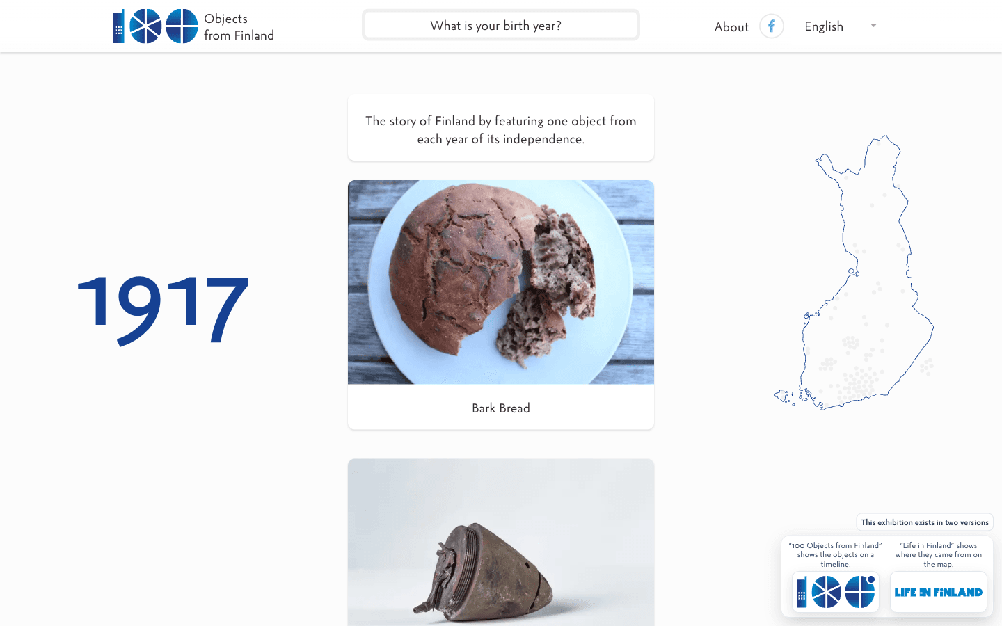
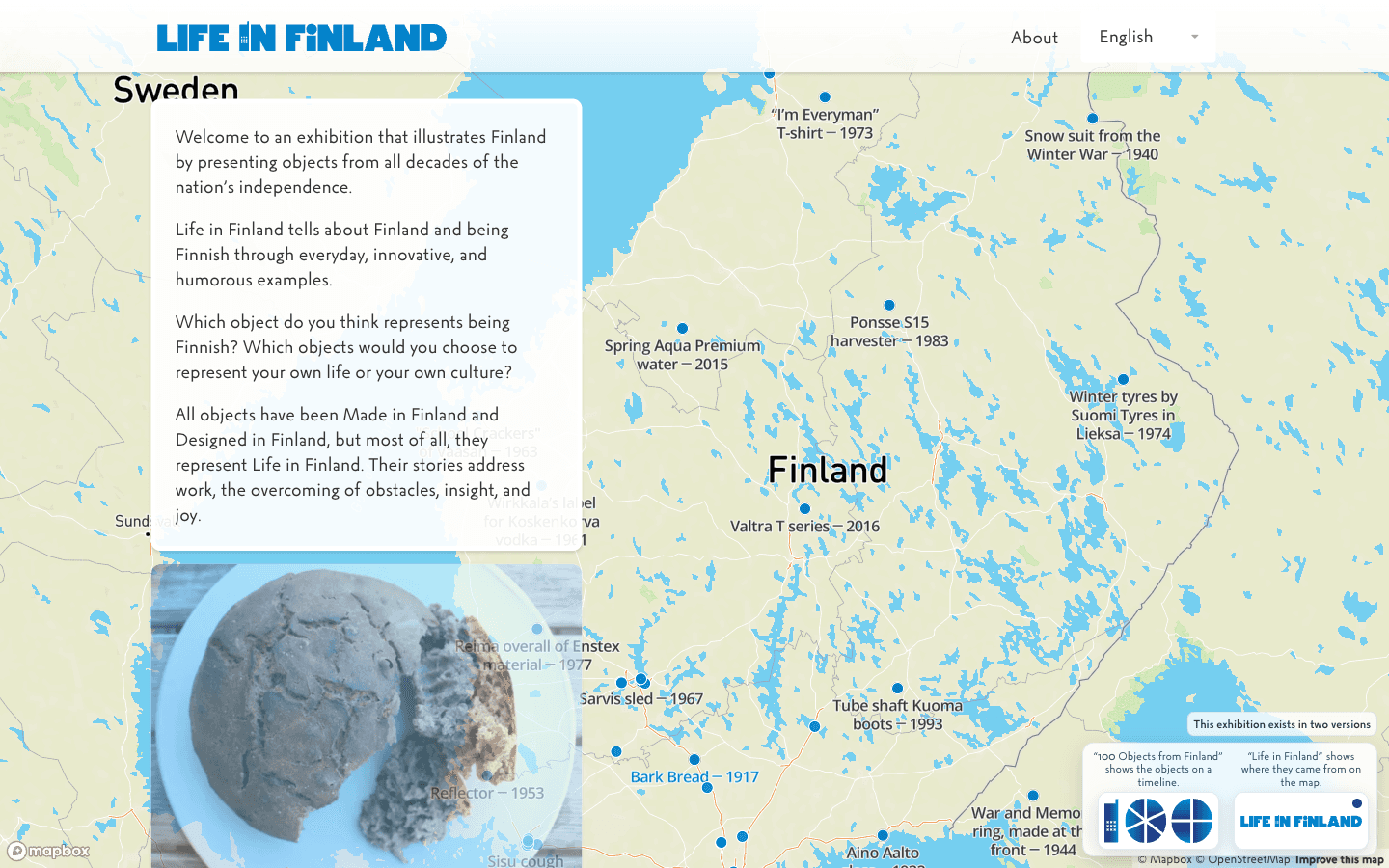
- Object-led grid
- Year as navigation
- Quiet paper palette
- Metadata has hierarchy
- Object card
- Year marker
- Collection filter
- Source note
- Language rail
- Image before interpretation
- Filters preserve context
- Metadata can expand
- Provenance stays attached
- 100+ objects
- Long titles
- Historic dates
- Multilingual content
- Image-light records
Raw Drafts
The Stranger Things Upside Down of HAAM. A void-black Y3K system where the cyberpunk octopus, neon signal rails, scanlines, grids, drafts, AI provenance and unstable experiments are allowed to take over. Deliberately stranger and less domesticated than HAAM.
Big decisions need a visible hierarchy.
STATUS · METADATA · 12:48:03Cyberpunk Y3K interface language for unfinished work, AI provenance and experiments that are allowed to stay strange.
- IBM Plex Mono + Sora / hard display type
- Void-black space with neon signal colors
- 56px grid, scanlines and orbit fields
- Square frames instead of friendly SaaS cards
- The octopus is a living mascot, not decoration
- Signal rail
- Y3K frame
- Octopus portal
- Neon status chip
- Article frame
- Orbit field
- Raw Drafts is HAAM's Upside Down
- The interface may feel infected, alive or unstable
- AI involvement and provenance stay visible
- Drafts and revisions are first-class states
- Glitch is texture, not an excuse for broken usability
- Long essays
- Live broadcaster
- Generated media
- Games and experiments
- 3D mascot
- Human + AI authorship
Working Matter
A quieter experimental system for unfinished spatial prototypes. Objects, annotations, coordinates and revisions can drift off the conventional page without inheriting Raw Drafts' cyberpunk world.
Big decisions need a visible hierarchy.
STATUS · METADATA · 12:48:03Leave the object where the thought happened.
- Revision is visible
- Serif + mono contrast
- Rough edges are allowed
- Whitespace can become physical space
- Coordinate label
- Revision rail
- Annotation
- Artifact card
- Spatial marker
- Objects can drift off-grid
- Annotations remain addressable
- Published is not necessarily final
- Space can carry hierarchy
- 3D / spatial views
- Unfinished prototypes
- Long annotations
- Object relationships
- Mobile spatial fallbacks
Instrument
A denser system for products that help someone resolve a state, approve a consequence or understand evidence. It is derived from the interaction contracts already defined across HAAM products.
Big decisions need a visible hierarchy.
STATUS · METADATA · 12:48:03- State before surface
- Dense sans hierarchy
- Evidence stays attached
- Semantic status colors
- Status pill
- Data row
- Approval bar
- Evidence chip
- Empty / loading / error
- Permission before consequence
- Suggestion differs from fact
- Failure paths are designed
- Missing data is explicit
- Dense tables
- Async agent work
- Permissions
- Partial data
- High-consequence actions
Coverage matrix
A system should fail somewhere useful.
Each family is pushed by different constraints. The gaps are invitations for the next app to break the system in a new way.
| Constraint | HAAM | Everyday Archive | Raw Drafts | Working Matter | Instrument |
|---|---|---|---|---|---|
| Responsive layouts | Strong | Strong | Strong | Experimental | Strong |
| Localization / i18n | 6 locales | Core constraint | Partial | Partial | Planned |
| Accessibility / WCAG | Production | Reading first | Needs stress test | Needs stress test | Core constraint |
| Dark / alternate themes | 4 combinations | Optional | Native | Experimental | Semantic |
| Dense data | Light | Metadata | Low | Low | Primary |
| AI states / provenance | Growing | Source records | Primary | Partial | Primary |
| Failure / empty states | Production | Missing records | Glitch + draft states | Draft state | Primary |
| Design-tool mirror | Next | Next | Next | Next | Next |
Artifact layers
One system, multiple mirrors.
The goal is not to duplicate work between tools. It is to make the same decisions inspectable by designers, engineers and reviewers.
Figma
Variables, semantic tokens, component properties, variants, Auto Layout, prototype states and Dev Mode handoff. The design file should mirror decisions already proven in products, not become a decorative component museum.
Code
React components, CSS custom properties, responsive rules, accessibility behavior and actual edge cases. The browser is where a token meets real content and starts losing arguments.
Storybook + docs
Component stories, state matrices, accessibility notes, contribution rules and usage guidance. Documentation should show when not to use a component as clearly as when to use it.
Governance
Versioning, contribution model, deprecation, design QA and release notes. Every new app is a stress test: either the system absorbs it or the rules have to change.
Care is part of the system
Build it. Keep it useful.
Good foundations let a product grow, be repaired and find a new expression as its context changes.
Help improve this website?
Optional analytics. Google Analytics and Clarity load only if allowed; form, email, and chat content are excluded.