Tilbake til HAAM

Designsystemer · v0.2

Ulike produkter. Felles regler.

Fem levende systemer som får svært ulike produkter til å føles bevisste, skalerbare og byggbare. Denne versjonen er med vilje konkret, slik at den er lettere å være uenig med.

5 systemer20+ flaterKode førstLaget for å utfordres

Porteføljens kjerne

Appene er bevisene. Systemene er porteføljen.

Cheap software makes output less impressive. The harder signal is whether a designer can create rules that survive many products, states, breakpoints, languages and implementation constraints. These systems turn that signal into something visible.

The browser is the canonical first surface today. Figma libraries and Storybook mirrors are explicitly shown as the next artifact layer where they do not exist yet.

Design tokensFigma variablesComponent libraryVariantsAuto LayoutResponsive designWCAGStorybookReactDesign QAGovernanceDeveloper handoff

Systemfamilier

Fem måter å bestemme hva som hører sammen.

Summer 26 og Raw Drafts finnes allerede som separate kodede designsystemer. De andre familiene er bevisste synteser eller systemer under utvikling.

01
LiveProduction system

Summer 26

HAAMs nåværende system: varm redaksjonell struktur, seriøst produktarbeid og en sesongbasert lys/mørk-fortelling i stedet for en generisk temabryter.

TOKENS / COLOR
Paper#fffef9
Ink#1b1a17
Sun#ffd83d
Fun#ff7faf
Grass#63d28b
TYPE / HIERARCHY
Aa

Big decisions need a visible hierarchy.

STATUS · METADATA · 12:48:03
SUMMER 26Serious work, with more sunshine in it.
CASE STUDYLIVE ↗
Grunnlag
  • Georgia + Arial
  • 3 painted accents
  • Cream / moonlight themes
  • Fluid clamp() scale
Komponenter
  • Floating chrome
  • Arrow pills
  • Signal chips
  • Tilted media
  • Editorial sections
Interaksjon
  • Dark mode is a retelling
  • One highlighter moment
  • Motion yields to reduced-motion
  • Rules before decoration
Stresstester
  • 6 locales
  • Season + mode combinations
  • Long-form case studies
  • Mobile chrome
  • Client + culture work
Design tokensResponsive designThemingAccessibilityLocalizationReactCSS custom properties
02
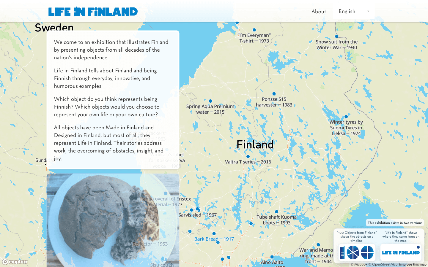
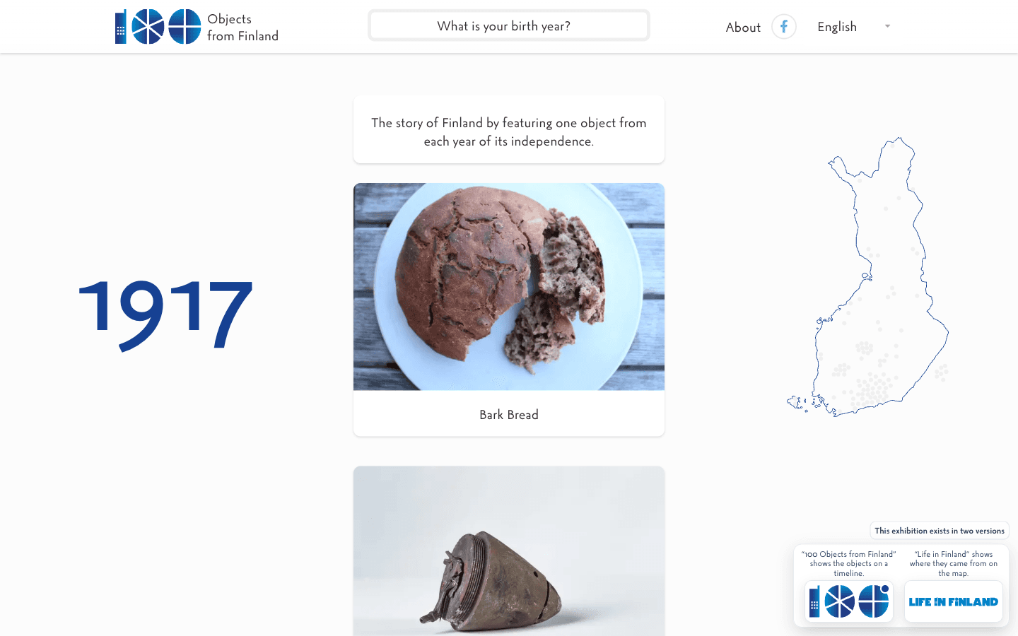
Generert syntese100 Objects + Life in Finland

Everyday Archive

Et nytt felles språk for kultursamlinger: objekt først, metadata etterpå, proveniens alltid synlig. Det er en syntese, ikke en påstand om at 2017-nettstedene brukte et formelt felles bibliotek.

TOKENS / COLOR
Archive paper#f1eee4
Museum ink#171713
Birch#d7c6a9
Object red#d64d3f
Lake#4b7088
TYPE / HIERARCHY
Aa

Big decisions need a visible hierarchy.

STATUS · METADATA · 12:48:03
1957
OBJECT 057Coffee potEveryday life · Finland
ALLHOMEWORKLEISURE
100 Objects from Finland website
Life in Finland website
Grunnlag
  • Object-led grid
  • Year as navigation
  • Quiet paper palette
  • Metadata has hierarchy
Komponenter
  • Object card
  • Year marker
  • Collection filter
  • Source note
  • Language rail
Interaksjon
  • Image before interpretation
  • Filters preserve context
  • Metadata can expand
  • Provenance stays attached
Stresstester
  • 100+ objects
  • Long titles
  • Historic dates
  • Multilingual content
  • Image-light records
Information architectureContent designComponent libraryInternationalizationMetadataResponsive grid
03
LiveHAAM's Upside Down · Y3K cyberpunk octopus

Raw Drafts

HAAMs Stranger Things-lignende Upside Down. Et kullsvart Y3K-system der cyberpunk-blekkspruten, neonsignaler, scanlines, rutenett, utkast, AI-proveniens og ustabile eksperimenter får ta over.

TOKENS / COLOR
Void#03020a
Signal cyan#67f7ff
Magenta#ff4fd8
Acid#c7ff2f
Violet#8b6dff
TYPE / HIERARCHY
Aa

Big decisions need a visible hierarchy.

STATUS · METADATA · 12:48:03
RAW DRAFTS // Y3KHAAM / UPSIDE DOWNSIGNAL LIVE
VOID / SIGNAL / DRAFT / AGENTThe octopus got into the system.

Cyberpunk Y3K interface language for unfinished work, AI provenance and experiments that are allowed to stay strange.

NOT THE MAIN WORLD
Grunnlag
  • IBM Plex Mono + Sora / hard display type
  • Void-black space with neon signal colors
  • 56px grid, scanlines and orbit fields
  • Square frames instead of friendly SaaS cards
  • The octopus is a living mascot, not decoration
Komponenter
  • Signal rail
  • Y3K frame
  • Octopus portal
  • Neon status chip
  • Article frame
  • Orbit field
Interaksjon
  • Raw Drafts is HAAM's Upside Down
  • The interface may feel infected, alive or unstable
  • AI involvement and provenance stay visible
  • Drafts and revisions are first-class states
  • Glitch is texture, not an excuse for broken usability
Stresstester
  • Long essays
  • Live broadcaster
  • Generated media
  • Games and experiments
  • 3D mascot
  • Human + AI authorship
Y3KCyberpunkDesign tokensAI interactionProvenanceMotion designEditorial system3D mascot
04
Generert synteseSpace + XYZ

Working Matter

Et roligere eksperimentelt system for uferdige romlige prototyper. Objekter, annotasjoner, koordinater og revisjoner kan drive utenfor den vanlige siden uten å arve Raw Drafts' cyberpunkverden.

TOKENS / COLOR
Canvas#f7f3e8
Carbon#0d0d0d
Clay#ff795f
Spatial#6d74ff
Moss#a3d77a
TYPE / HIERARCHY
Aa

Big decisions need a visible hierarchy.

STATUS · METADATA · 12:48:03
SPACE / XYZCOORD 031
Leave the object where the thought happened.
revision / spatial / still moving
Grunnlag
  • Revision is visible
  • Serif + mono contrast
  • Rough edges are allowed
  • Whitespace can become physical space
Komponenter
  • Coordinate label
  • Revision rail
  • Annotation
  • Artifact card
  • Spatial marker
Interaksjon
  • Objects can drift off-grid
  • Annotations remain addressable
  • Published is not necessarily final
  • Space can carry hierarchy
Stresstester
  • 3D / spatial views
  • Unfinished prototypes
  • Long annotations
  • Object relationships
  • Mobile spatial fallbacks
Spatial interactionDesign system governanceContent statesVersioningExperimental UIEditorial design
05
Under utviklingHAAM operational products

Instrument

Et tettere system for produkter som hjelper noen med å løse en tilstand, godkjenne en konsekvens eller forstå evidens. Det bygger på interaksjonskontraktene som allerede er definert på tvers av HAAM-produktene.

TOKENS / COLOR
Surface#f5f6f7
Text#111318
Action#315efb
Success#2e8a58
Attention#e89a24
TYPE / HIERARCHY
Aa

Big decisions need a visible hierarchy.

STATUS · METADATA · 12:48:03
Review queue3 need action
READYImport site map12 receipts
CHECKPublish changePermission required
Grunnlag
  • State before surface
  • Dense sans hierarchy
  • Evidence stays attached
  • Semantic status colors
Komponenter
  • Status pill
  • Data row
  • Approval bar
  • Evidence chip
  • Empty / loading / error
Interaksjon
  • Permission before consequence
  • Suggestion differs from fact
  • Failure paths are designed
  • Missing data is explicit
Stresstester
  • Dense tables
  • Async agent work
  • Permissions
  • Partial data
  • High-consequence actions
Figma variablesVariantsAuto LayoutWCAGDesign QADeveloper handoffStorybook

Dekningsmatrise

A system should fail somewhere useful.

Each family is pushed by different constraints. The gaps are invitations for the next app to break the system in a new way.

Design system capability coverage
ConstraintSummer 26Everyday ArchiveRaw DraftsWorking MatterInstrument
Responsive layoutsStrongStrongStrongExperimentalStrong
Localization / i18n6 localesCore constraintPartialPartialPlanned
Accessibility / WCAGProductionReading firstNeeds stress testNeeds stress testCore constraint
Dark / alternate themes4 combinationsOptionalNativeExperimentalSemantic
Dense dataLightMetadataLowLowPrimary
AI states / provenanceGrowingSource recordsPrimaryPartialPrimary
Failure / empty statesProductionMissing recordsGlitch + draft statesDraft statePrimary
Design-tool mirrorNextNextNextNextNext

Artefaktlag

One system, multiple mirrors.

The goal is not to duplicate work between tools. It is to make the same decisions inspectable by designers, engineers and reviewers.

01Next mirror

Figma

Variables, semantic tokens, component properties, variants, Auto Layout, prototype states and Dev Mode handoff. The design file should mirror decisions already proven in products, not become a decorative component museum.

02Canonical now

Code

React components, CSS custom properties, responsive rules, accessibility behavior and actual edge cases. The browser is where a token meets real content and starts losing arguments.

03Next mirror

Storybook + docs

Component stories, state matrices, accessibility notes, contribution rules and usage guidance. Documentation should show when not to use a component as clearly as when to use it.

04Built by pressure

Governance

Versioning, contribution model, deprecation, design QA and release notes. Every new app is a stress test: either the system absorbs it or the rules have to change.

Dette er versjon 0.2

Find the thing that feels wrong and change it.

That friction is useful. A bad concrete choice gives taste something to push against.

Help improve this website?

Optional analytics. Google Analytics and Clarity load only if allowed; form, email, and chat content are excluded.