Estonian Academy of Arts / Higher education / 2017-Present

A redesign is a moment. An institution keeps moving.

EKA's web project did not begin with HAAM, or with the CVI. By the time Solveig Jahnke contacted me in May 2017, the academy already had earlier research, analytics, wireframes, and a proposed redesign for its existing WordPress site. I joined to interrogate that work, turn it into a functioning product, resolve the parts the drawings could not anticipate, and help test and hand it over. A later redesign brought a new visual identity and CVI into the same living platform. In 2026 EKA hired HAAM for another year to upgrade the server, accessibility, performance, and cybersecurity.

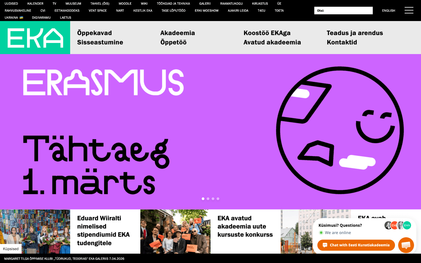
Estonian Academy of Arts website showing admissions, curricula, news, and events.

research before the build

2016→

EKA's earlier web-analysis plan covered interviews, surveys, usability testing, analytics, SEO, and conversion before HAAM joined.

HAAM joins

2017

I inherited an existing WordPress site, research, wireframes, and proposed designs, then took the redesign into implementation and testing.

a later system layer

CVI + redesign

The new visual identity arrived with another redesign and had to become responsive, reusable behaviour rather than a static graphic handoff.

technical stewardship

2026→

The current mandate covers server upgrades, accessibility, performance, cybersecurity, and continued platform health.

The real starting point

The website had a history before I touched it.

When Solveig sent me the background material in May 2017, one document was an existing EKA web-analysis plan with a stated deadline of 1 May 2016. It identified slow information finding for students and staff, dissatisfied departments, weak conversion optimization, and missed SEO opportunities. The proposed research included interviews with staff, students, and prospective students, questionnaires for three audiences, usability tests with five prospective students, exit surveys, and Google Analytics analysis of traffic, drop-off, bounce, devices, and browser problems.

The plan was already aimed at turning evidence into new design views, testing those views with users, and increasing international applications. When Solveig first approached HAAM on 24 May 2017, wireframes by Jaan Sonberg and a possible design solution already existed. My starting point was therefore not a blank canvas. It was a partly researched, partly designed, legacy product that still had to survive contact with real content, real editors, and the rest of the institution.

The project lifecycle

Research first. Build in reality. Keep absorbing change.

  1. 01Inherit the evidence

    Earlier research, analytics, Jaan Sonberg's wireframes, a conversion-focused redesign, and the existing WordPress platform formed the starting conditions.

  2. 02Turn drawings into a product

    Implementation exposed missing states, new content types, navigation questions, mobile behaviour, search, galleries, and editorial workflows that static views could not fully resolve.

  3. 03Let the system evolve without dissolving

    Testing, Trello handover, a later CVI-driven redesign, years of editorial change, and now technical renewal all became part of one continuing platform.

Inheritance

Do not erase the work that happened before you arrived.

The first useful design decision was to read what already existed. EKA had commissioned analysis, optimization thinking, Jaan Sonberg's wireframes, and visual proposals before HAAM entered the project. The proposed visual direction had been produced by a Latvian designer recommended by an Estonian conversion specialist. I reviewed those materials as design evidence rather than pretending the project began with my contract.

  • Start from the existing research questions and known findability problems
  • Use the live site's real content rather than designing around placeholder text
  • Separate inherited decisions from the gaps that still need product judgment

Interaction architecture

A visual redesign changes structure when real content arrives.

My June 2017 review agreed that the supplied redesign improved hierarchy and findability, but it also identified missing interaction states: mobile navigation, search results, persistent context, galleries, course registration, login, and the boundaries with external systems. By September it was clear that the work was not merely a visual reskin. New intermediate pages, content types, fields, and information structures were changing the product itself.

  • Search and mobile navigation treated as primary information-finding tools
  • New content types and page relationships resolved against real institutional content
  • Registration, login, galleries, and external systems treated as journeys rather than isolated screens

Testing and Trello

Move disagreements into a shared working system.

The EKA2017 Trello board became the place where implementation, design feedback, user testing, content questions, and bugs could meet. Solveig described the artun project as having started in Trello and moved it back there during the 2017 build so conversations and tasks stayed visible. Feedback from people inside EKA, external optimization and architecture input, and implementation questions could become concrete cards instead of disappearing into meetings.

  • Internal testing feedback became trackable work rather than an inbox archive
  • Design files, missing states, content problems, and implementation details lived in one shared process
  • The same board continued supporting EKA's day-to-day evolution for years after launch

CVI and redesign

The design system arrived later. The platform had to absorb it.

In June 2017 Solveig explicitly described the current work as an interim design update and said a new visual identity would come later with EKA's move to the new building. That later visual-identity phase brought a clearer CVI and further redesign work. Stuudio Stuudio supplied the visual system and detailed responsive homepage design; my job was to translate it into production behaviour across breakpoints, content states, components, and an already living site.

  • Visual identity rules translated into reusable web behaviour instead of page-by-page styling
  • Responsive implementation tested across devices and browsers, not copied from one fixed canvas
  • Design questions stayed collaborative between EKA, Stuudio Stuudio, and implementation

Stewardship

Handover is not the end of responsibility.

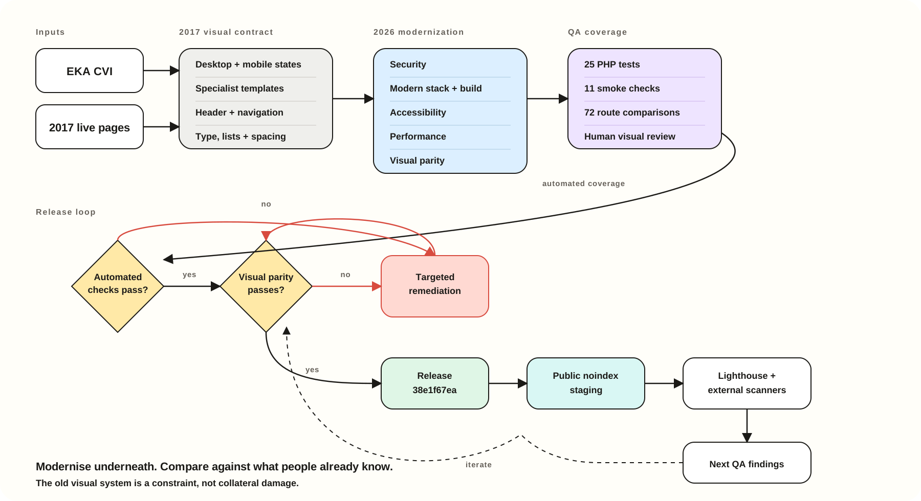
The site kept changing after the redesigns. Editors needed guidance, departments needed new structures, browsers and WordPress changed, and Trello kept collecting real operational problems. In 2026 EKA hired HAAM for another year, this time with an explicit technical-health mandate covering the server, accessibility, performance, and cybersecurity.

  • Preserve editorial continuity while modernising the underlying infrastructure
  • Treat accessibility and performance as baseline product quality
  • Treat cybersecurity and technical documentation as ongoing stewardship rather than emergency work

After launch

The handover became an operating relationship.

The evidence after launch is less glamorous and more valuable than a launch screenshot. The EKA2017 board continued accumulating questions about menus, categories, galleries, admissions pages, multilingual behaviour, publishing, calendars, media, and editor workflows across multiple years. By 2018 EKA was also preparing internal website-use guidance. The system was being used by the institution, not preserved as a pristine portfolio object.

That long life changes what good design means. Consistency is partly visual, but it is also whether editors can understand the rules, whether old decisions can be revisited without breaking everything else, and whether the technology underneath remains safe and usable. The new 2026 work continues the same idea at a deeper layer: make a proven public platform faster, more accessible, more secure, and easier to keep healthy.

  • A shared Trello process that outlived the original launch cycle
  • Editorial guidance and reusable structures for distributed publishing
  • Ongoing server, accessibility, performance, and security work as part of the product lifecycle

HAAM’s role

I joined after the research and redesign had begun, then became responsible for making the system work in reality and keep working over time.

Product, interface, and operations

HAAM's role began with reviewing existing research, analytics, Jaan Sonberg's wireframes, and proposed designs, then expanded into interaction design, information architecture, implementation, responsive behaviour, search and content-system decisions, testing, Trello-based handover, ongoing development, and long-term technical stewardship. The pre-HAAM visual proposal was produced by a Latvian designer recommended by an Estonian conversion specialist. A later visual-identity and CVI redesign was developed by Stuudio Stuudio and collaborators and integrated into the live platform with HAAM. The current mandate adds server upgrades, accessibility, performance, and cybersecurity.

Next case study

A border-city residency with more than one public.

View NART

How we learned

Research

Stakeholder research

The org chart was not the user journey.

Research looked across admissions, degree levels, programmes, departments, study services, research, events, languages, and the people maintaining all of it. The useful structure emerged by comparing visitor tasks with institutional ownership rather than choosing one side.

  • Content audit
  • Task mapping
  • Stakeholder collaboration
  • Editorial governance

Evidence trail

Why the interface is this way.

TASK + CONTENT DATA

Good interaction design should be traceable upstream. Depending on the project, that upstream work might be interviews, co-design, fieldwork, archive work, testing, analytics, or operations. Here is the shortest version of the chain from evidence to decision.

01

Evidence

Admissions, degree levels, programmes, departments, study services, research, events, languages, and public audiences competed inside one institution.

02

Interpretation

Visitor tasks cut across the academy's internal org chart, so organisational ownership is context rather than primary navigation.

03

Design decision

Prioritise intent, use structured programme records, and connect recurring content back to responsible units.

04

Result

Institutional complexity becomes easier to navigate while departments retain a maintainable publishing structure.

Help improve this website?

Optional analytics. Google Analytics and Clarity load only if allowed; form, email, and chat content are excluded.