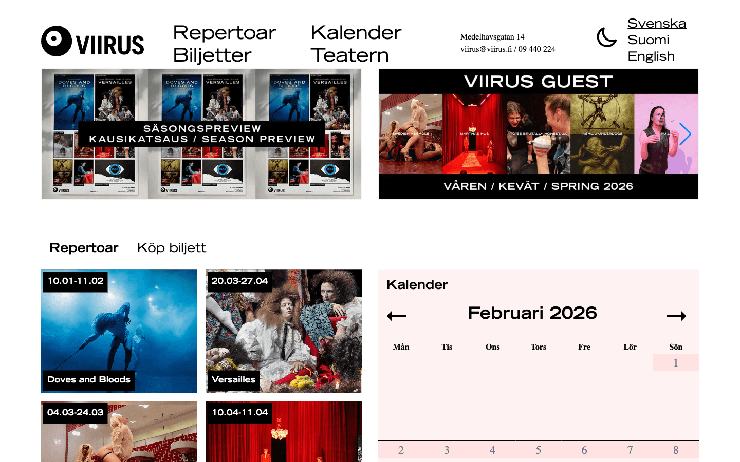
Viirus Theatre
Teatterisivusto, joka rakennettiin uudelleen suorituskyvyn, saavutettavuuden, ohjelmiston löytämisen, kalenterin, lippujen, yksityisyyden ja päivittäisen sisällönhallinnan ympärille.


Valitut työt
Yksityiskohtaisia tarinoita HAAMin projektien käyttöliittymäratkaisuista, sisältöjärjestelmistä ja toiminnallisesta ajattelusta.
Teatterisivusto, joka rakennettiin uudelleen suorituskyvyn, saavutettavuuden, ohjelmiston löytämisen, kalenterin, lippujen, yksityisyyden ja päivittäisen sisällönhallinnan ympärille.
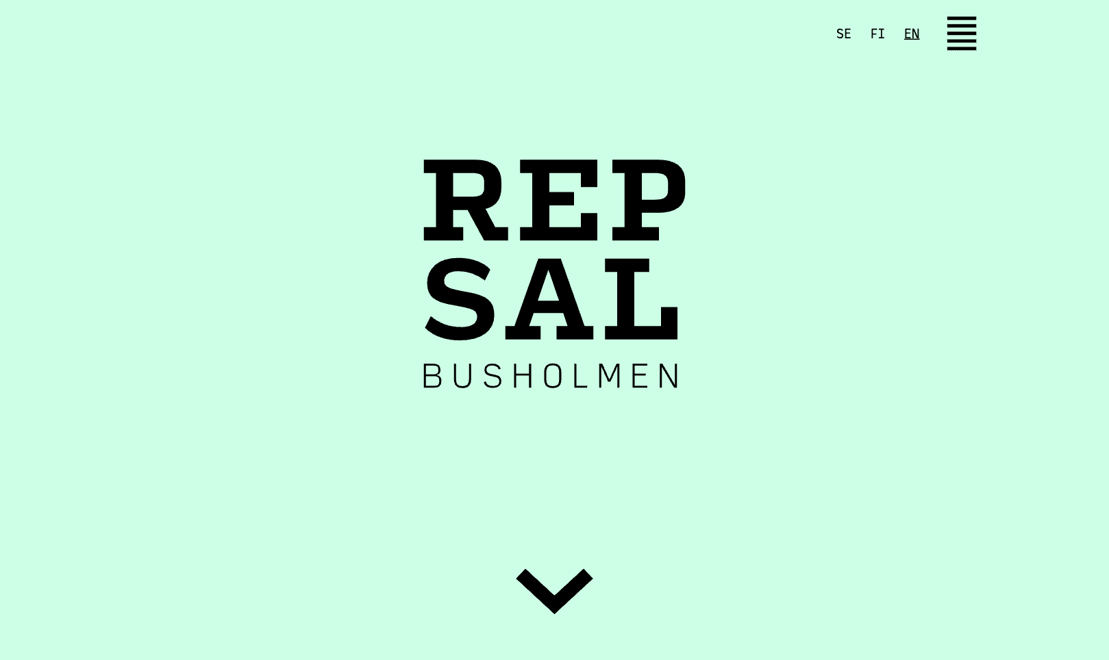
Harjoitustilapalvelu, joka yhdistää tilatiedot, saatavuuden, ehdot ja varaustiedot yhdeksi päätösvalmiiksi poluksi.
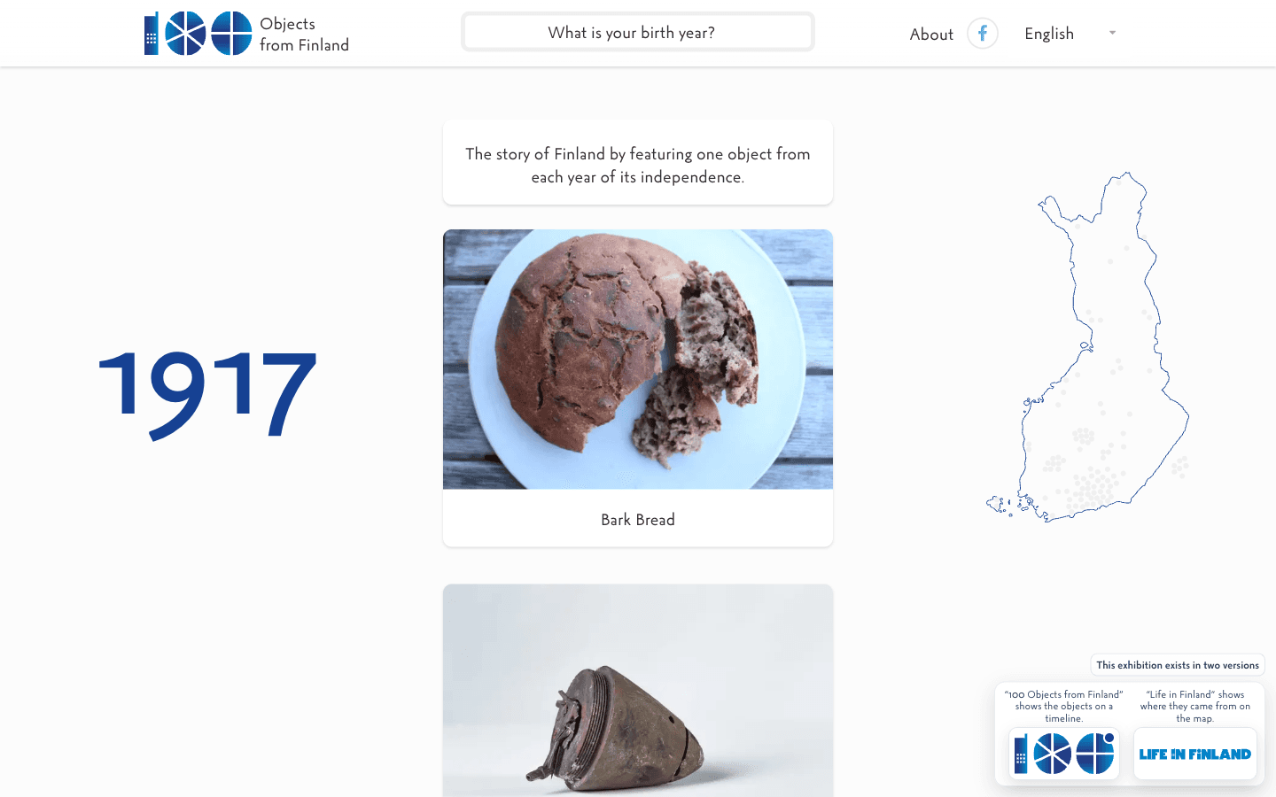
Monikielinen digitaalinen näyttely, joka tekee sadan vuoden Suomen historiasta tutkittavan esineiden ja vuosien sarjan.
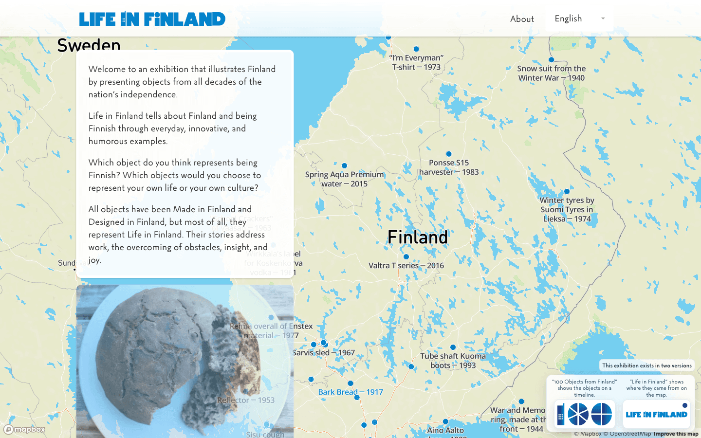
Monikielinen kulttuurikokoelma, joka tekee kansallisesta historiasta konkreettista arkisten esineiden, tunnistamisen ja uteliaisuuden kautta.
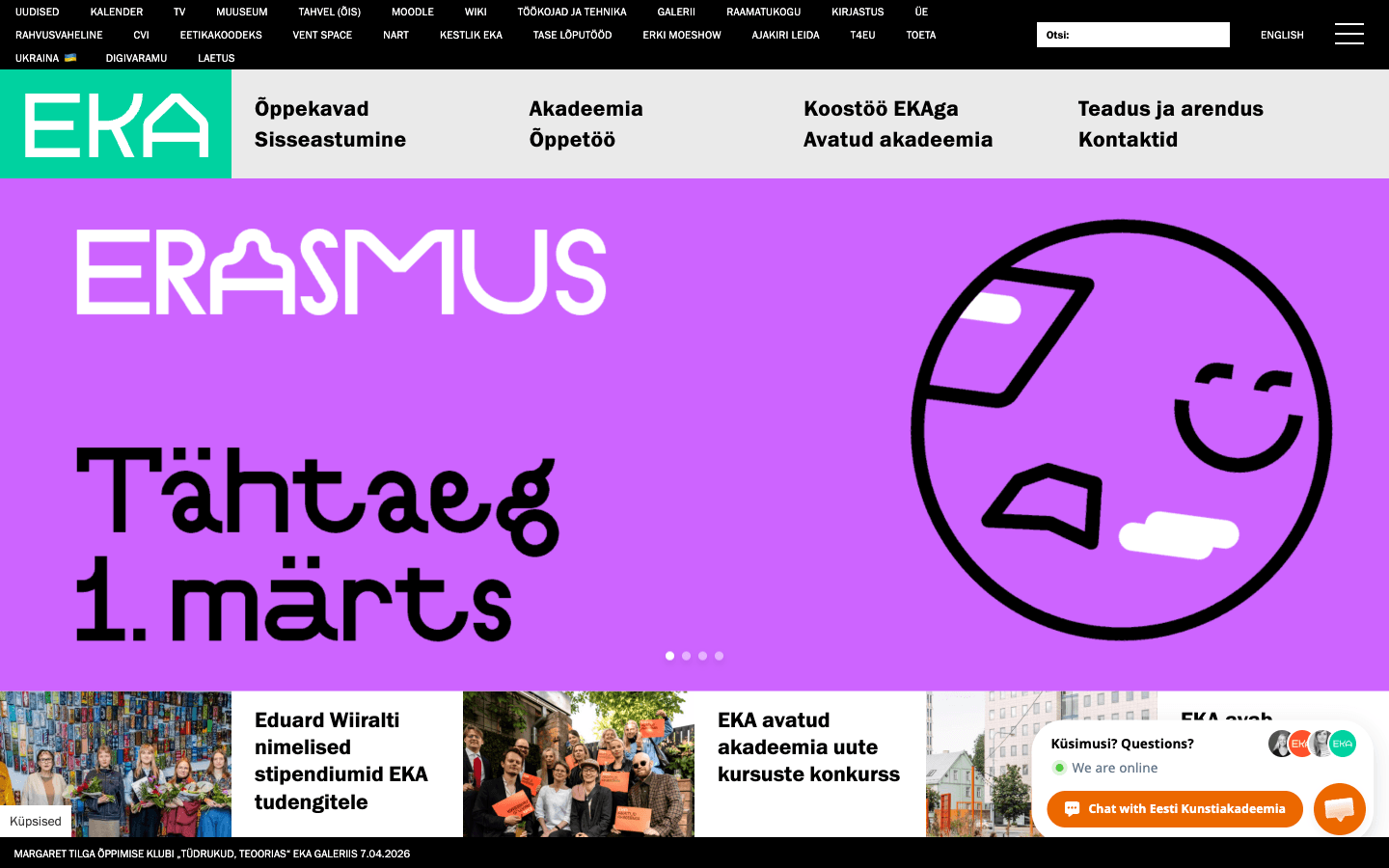
Laaja akatemia-alusta, joka jäsentyy hakemisen, koulutusohjelmien, opiskelupalvelujen, tutkimuksen, tapahtumien ja kestävän sisältövastuun ympärille.
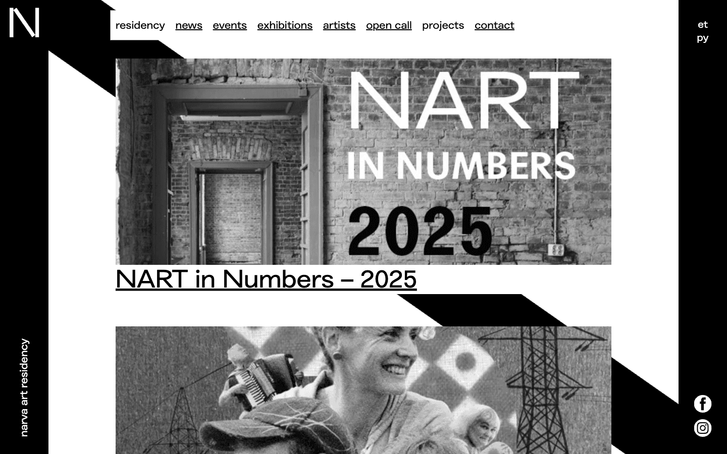
Residenssialusta, joka pitää hakijat, taiteilijat, paikalliset yleisöt, opettajat, vierailijat ja arkistoidut työt yhteydessä.
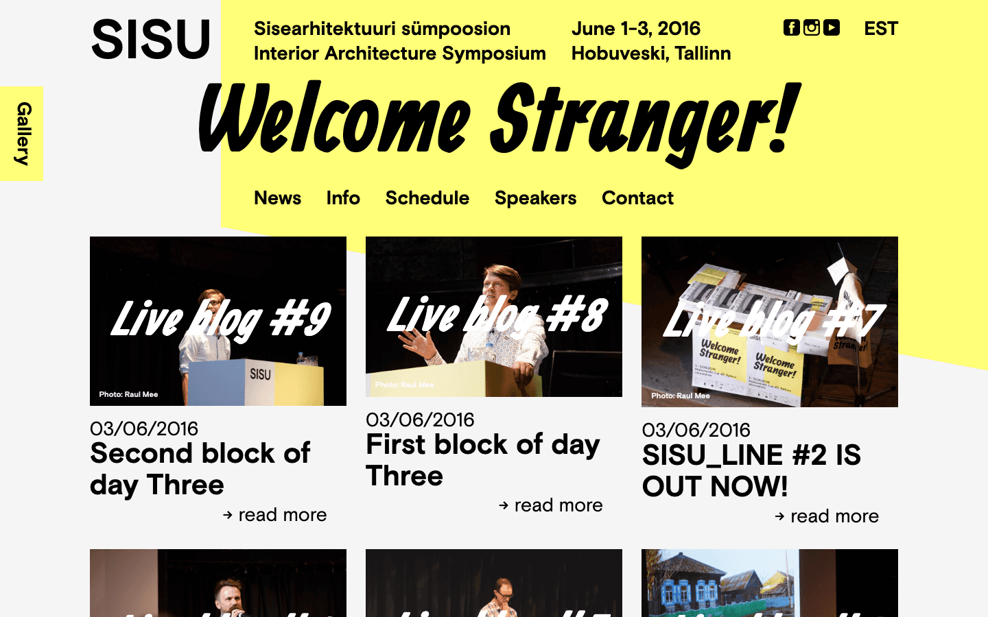
Vuosien työ sisustusarkkitehtien liitolle: liiton verkkosivut, kaksi symposiumin versiota Tallinnassa ja Luzernissa sekä alan oma julkaisu SISU_LINE.
Yhden päivän maailmanlaajuinen siivous: monikielinen liittyminen, kausiluonteinen infrastruktuuri ja kutsugeneraattori, jolla vapaaehtoiset kutsuivat omat ystävänsä.
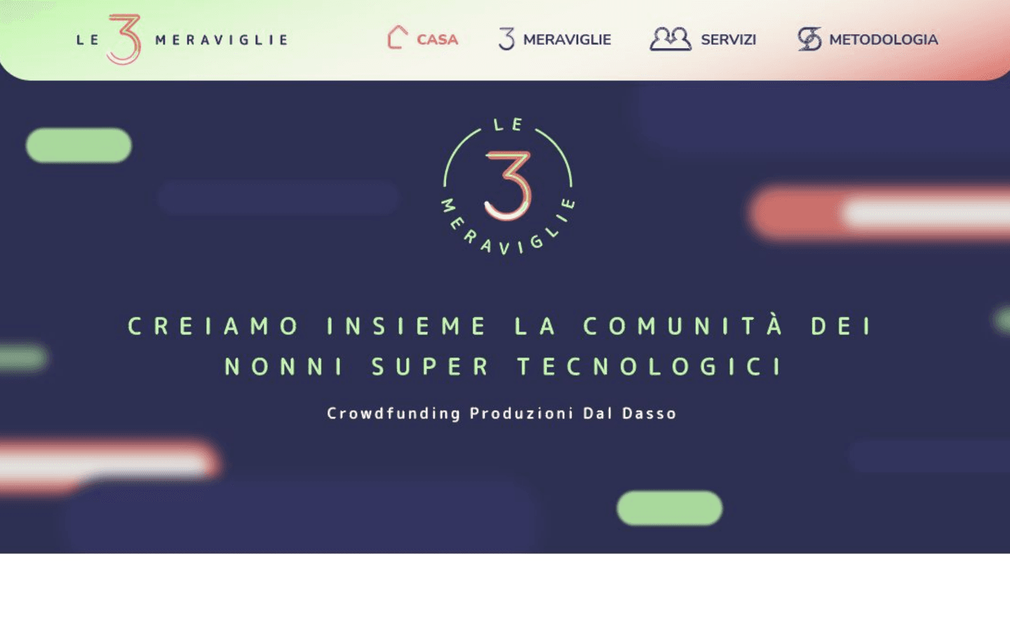
Sukupolvien välinen hanke pandemia-ajan eristyneisyyttä vastaan Trentinossa: yli 60-vuotiaat toimivat konsultteina ja heidän muistoistaan syntyi kolme tuotetta.
Valittu työpanos
Jotkin toimeksiannot ovat liian rajattuja täydeksi tapaustutkimukseksi, mutta työpanos ja sen yhteys ovat silti merkityksellisiä.

HTTP- ja WebSocket-rajapinnat neljään interaktiiviseen installaatioon.
Vuonna 2016 Platvorm tilasi HAAMilta API-taustajärjestelmän neljään Viron kansallismuseon interaktiiviseen installaatioon: Baltikett, Kontaktkeeled, Aavik ja Verbid.
Platvorm vastasi näyttelyn suunnittelusta ja tuotannosta. HAAM toimi alihankkijana vain tässä tarkasti rajatussa taustajärjestelmäroolissa, ja työ johti kutsuun museon avajaisiin.
Näyttelyn suunnittelu ja tuotanto: Platvorm
Optional analytics. Google Analytics and Clarity load only if allowed; form, email, and chat content are excluded.