Discover
What is on?


Case study / Interaction design / Viirus Theatre
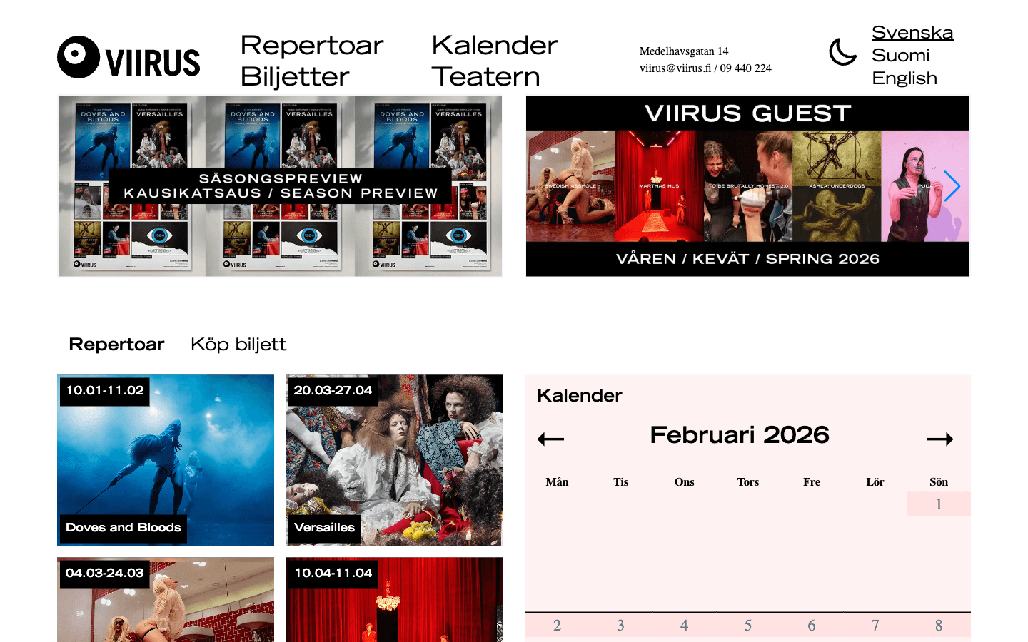
Viirus is a theatre, but its website behaves like a time-sensitive public service. A visitor has to discover a production, choose a date, understand language and accessibility context, resolve whether that performance is actually available, and then cross into an external ticket system without losing confidence.
Interaction model
The useful unit was not a page. It was the transition from vague interest to one actionable performance. Each step had to answer a different question without making the visitor reconstruct the theatre's internal content structure.
What is on?
Which performance?
Available, selected, sold out, focused
Date, language, access context
Continue to external ticketing
Decision 01 / State
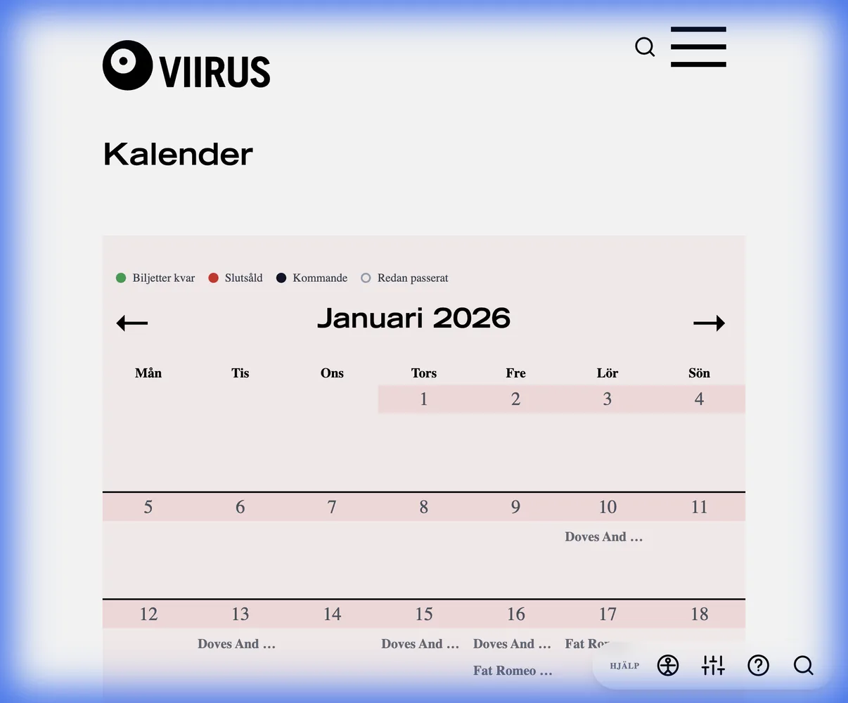
A date is not enough. The same calendar has to communicate which performance is available, which one is selected, which one is sold out, and where keyboard focus currently sits. Those states are part of the information architecture because they change what the visitor can do next.
Design rule: do not make hover carry information that touch and keyboard users also need.
Decision 02 / Control
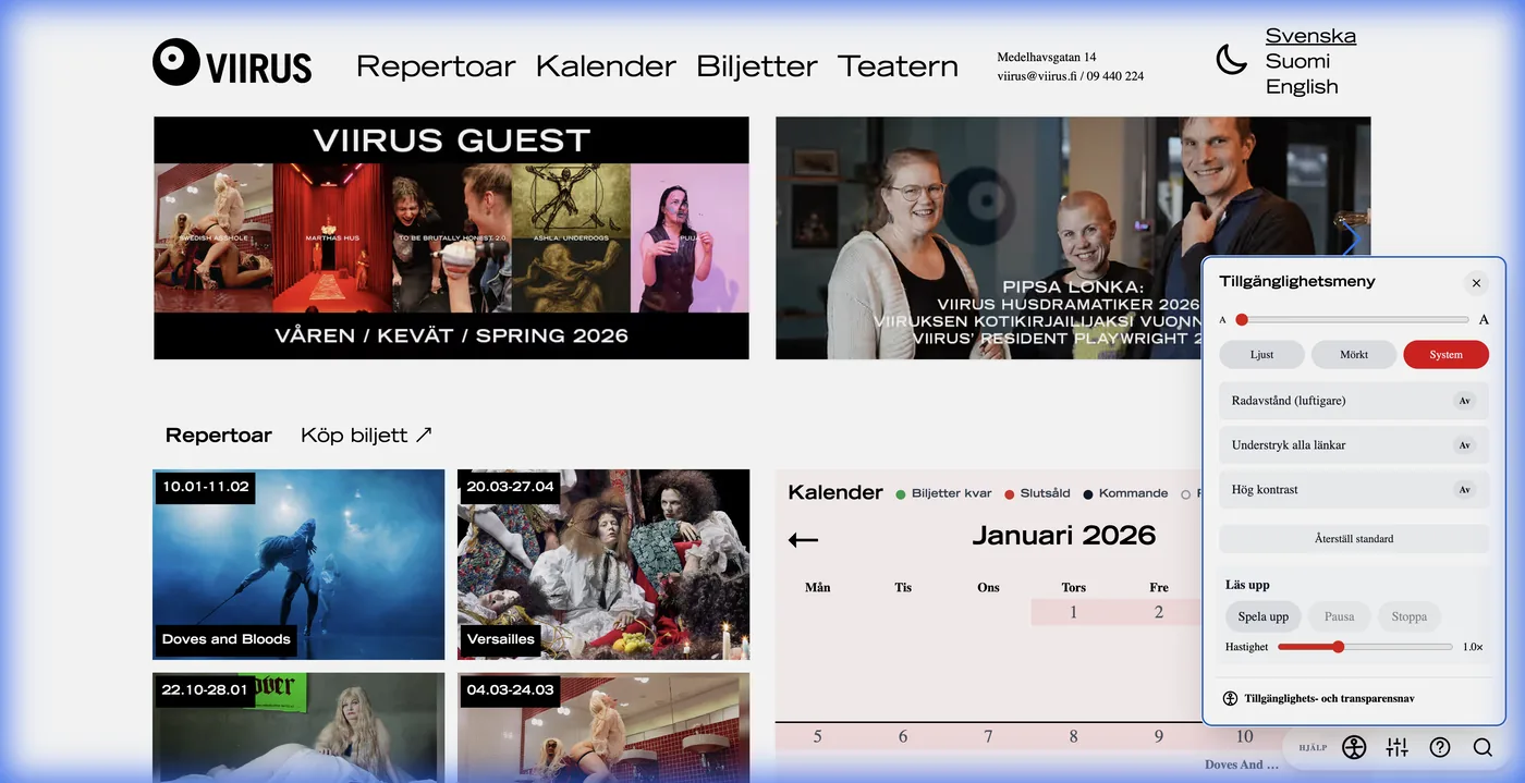
Accessibility was treated as behavior, not a compliance paragraph. Text size, spacing, contrast, motion, focus styling, target size, readable links, status messages, and keyboard-safe overlays all change the way the interface responds to a person.
Design rule: accessibility settings should alter the interface immediately and predictably.
Decision 03 / Latency
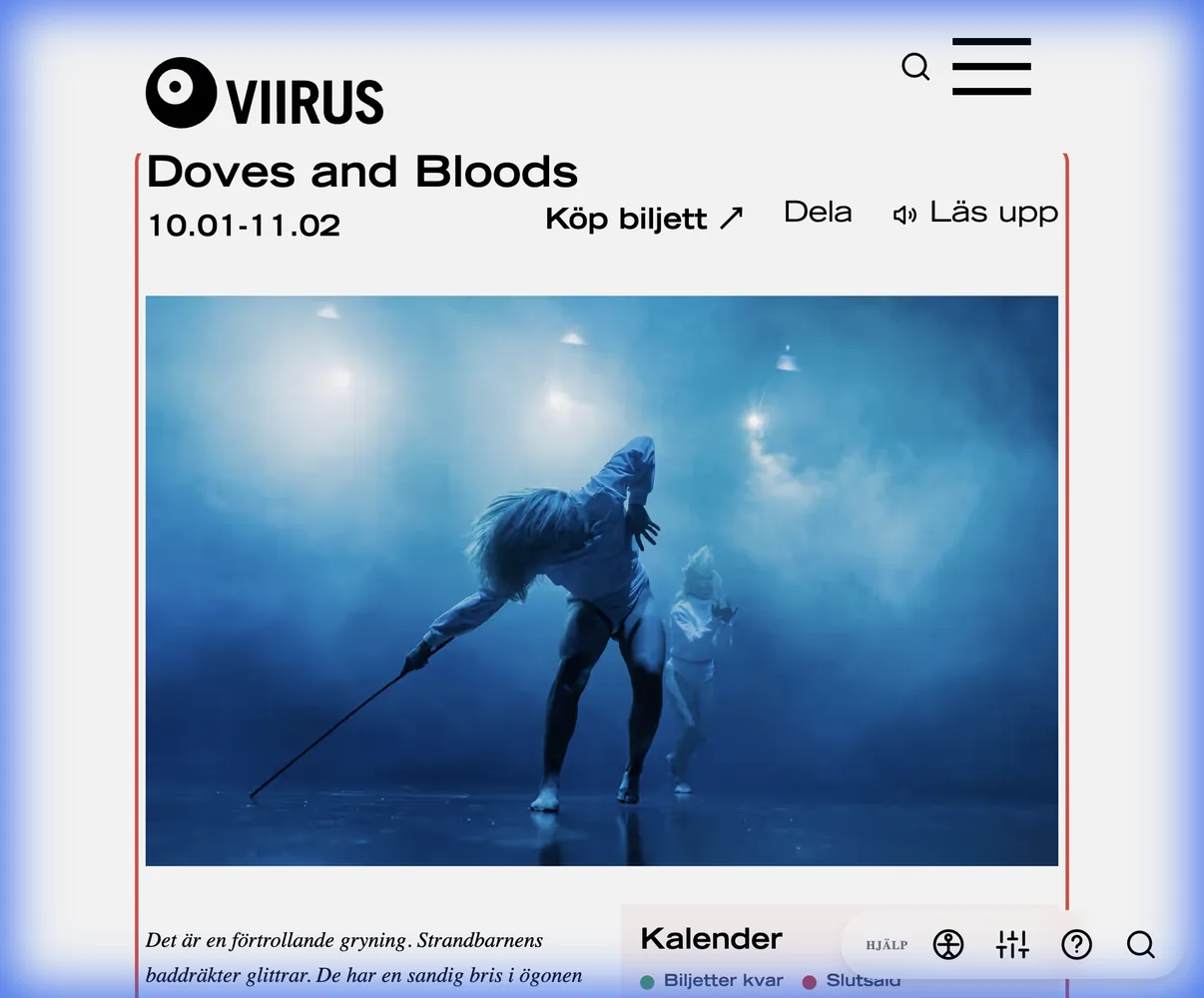
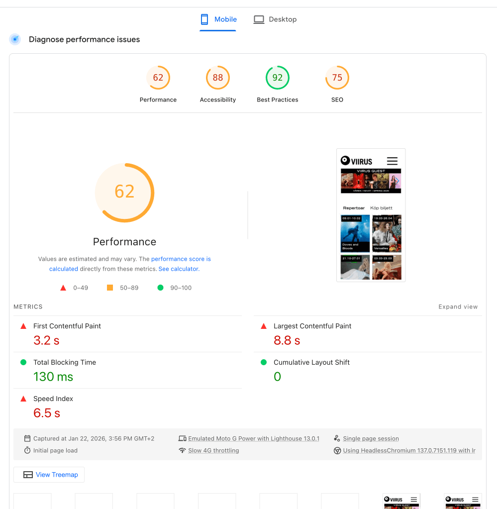
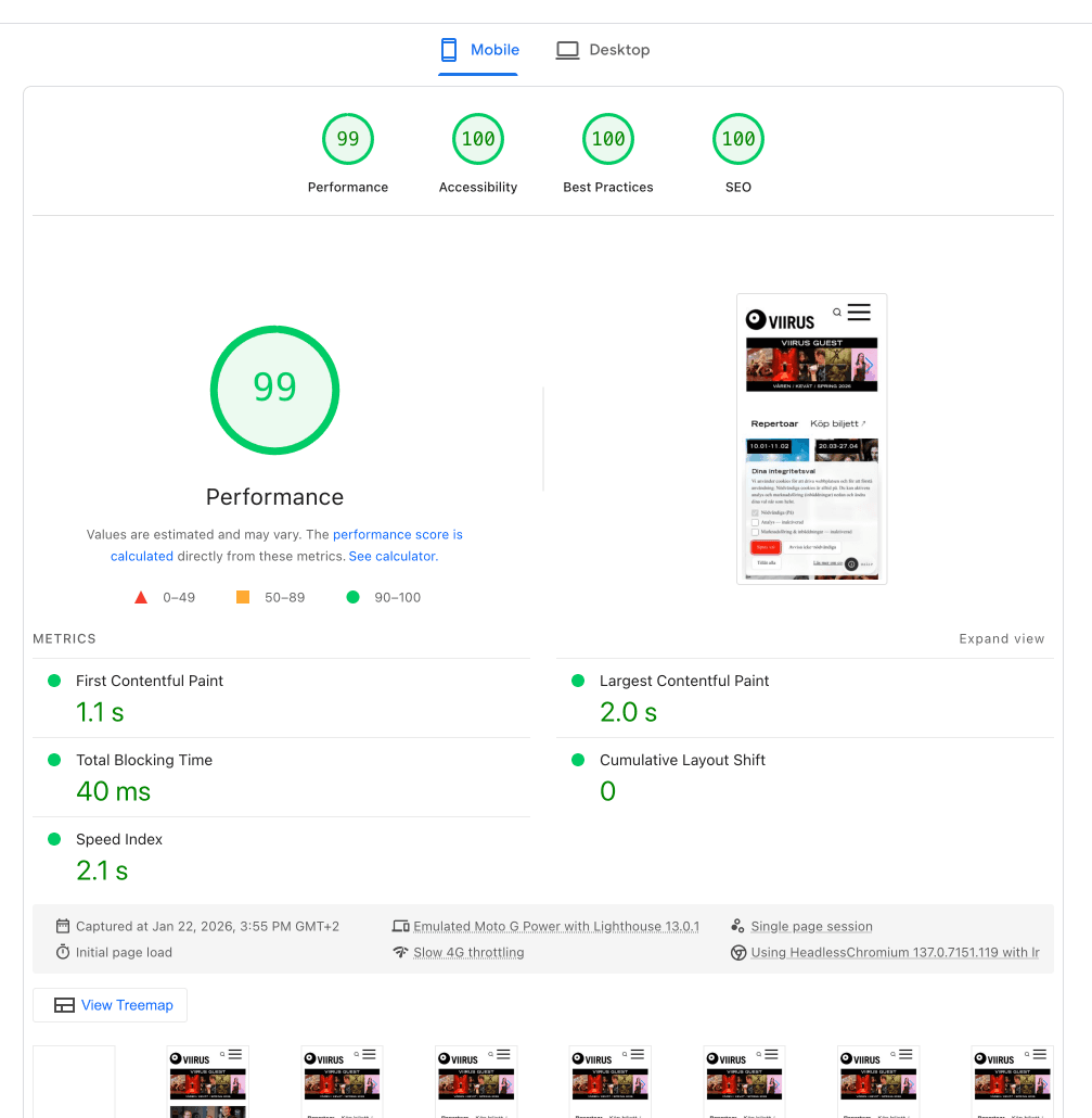
Large cultural imagery was kept, but the critical path was made lighter with modern image delivery, responsive sizing, caching, and less blocking work. The point was not a better benchmark screenshot by itself. Faster rendering shortens the gap between intention and feedback, especially on phones and slower connections.
Decision 04 / Trust
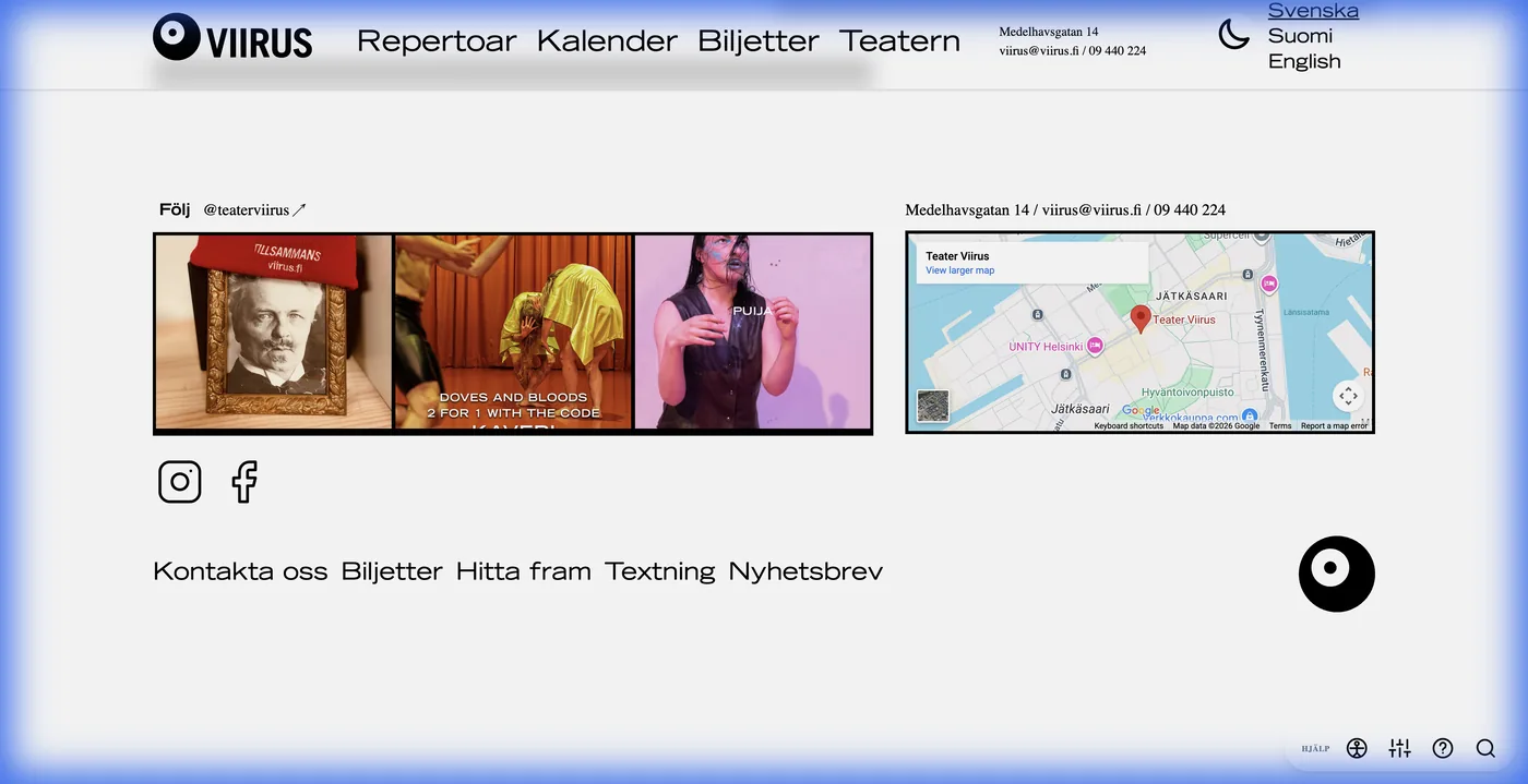
Expensive external embeds were replaced or held behind consent. A custom social gallery preserved the theatre's visual presence while reducing third-party loading. Privacy, performance, and sustainability became the same interaction question: what should the system do before the visitor has asked for it?
Design rule: defer external work until it is necessary or explicitly permitted.
Receipts
This version separates observation, design decision, implementation evidence, and measured result. The finished screenshot is still here, but it is no longer doing all the work.
Repertoire, Calendar, Tickets, language switching, search, and the external Fienta ticket handoff are all visible in the public site. The interaction problem is not a hypothetical portfolio exercise; it sits in the everyday service structure.
The internal evidence trail records mobile performance audits, accessibility requirements, repertoire and calendar tasks, ticket journeys, privacy constraints, and daily editorial use as the material that shaped the redesign.
The project archive contains dedicated captures for calendar interactions, search, accessibility controls, performance, privacy, and before/after PageSpeed evidence. The case study can show behavior instead of asking the reader to trust a sentence about it.
How we learned
Research combined mobile performance audits, accessibility requirements, repertoire and calendar tasks, ticket journeys, privacy constraints, and the theatre's daily editorial work. Looking at the public and operational sides together exposed the friction that visual redesign alone would miss.
Evidence trail
Good interaction design should be traceable upstream. Depending on the project, that upstream work might be interviews, co-design, fieldwork, archive work, testing, analytics, or operations. Here is the shortest version of the chain from evidence to decision.
01
Mobile performance audits, accessibility requirements, repertoire and calendar tasks, ticket journeys, privacy constraints, and daily editorial use exposed the main friction.
02
A theatre visitor is usually answering a time-sensitive question on a phone, so loading, programme state, language, accessibility, and tickets carry the most weight.
03
Unify search and calendar discovery, make states explicit, keep accessibility controls practical, gate expensive media, and lighten the critical path.
04
The rebuilt experience is faster and more accessible while repertoire, dates, and ticket actions have a clearer hierarchy.
Optional analytics. Google Analytics and Clarity load only if allowed; form, email, and chat content are excluded.