876
eligible survey responses
Students across Taiwan; research participants, not product users.
Taiwan · 2023 to 2025 · MA interaction design · National Cheng Kung University
What if the world behind a product were as visible as its price?
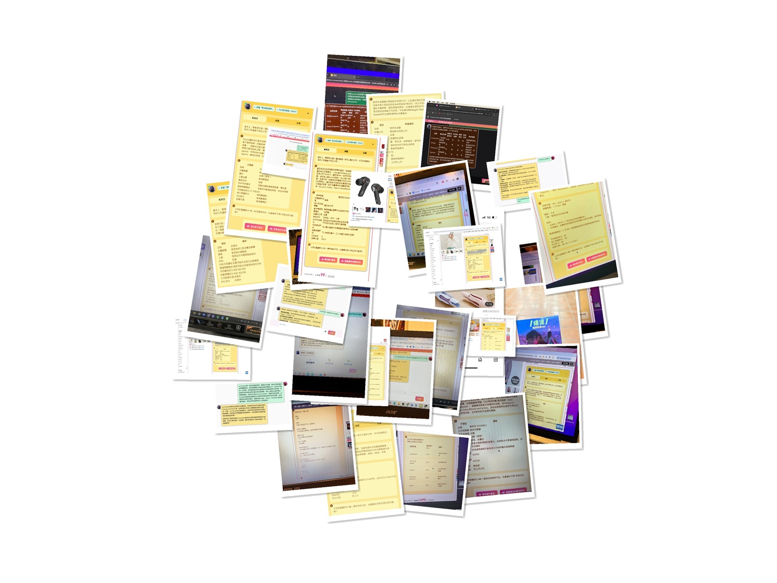
A master's research project by Kris Haamer at National Cheng Kung University. I built and tested an experimental browser extension with students across Taiwan to explore how product origins, labor, environmental claims, and alternatives could enter everyday shopping.
876
eligible survey responses
Students across Taiwan; research participants, not product users.
32
moderated prototype sessions
Face-to-face tests across seven universities.
7
expert interviews
Sustainability, finance, policy, and technology perspectives.
Beyond the checkout
E-commerce makes the transaction easy to see. The materials, working conditions, and ecological consequences behind an object are harder to find. Green Filter explored what happens when that missing context becomes part of the interface.
01 / Visibility
Objects carry histories of materials, work, production, transport, and disposal that rarely appear at checkout.
02 / Agency
Better information for individuals matters, but it cannot replace collective decisions and institutional accountability.
03 / Trust
AI can help someone ask better questions. It does not make uncertain or contested evidence certain.
Research system
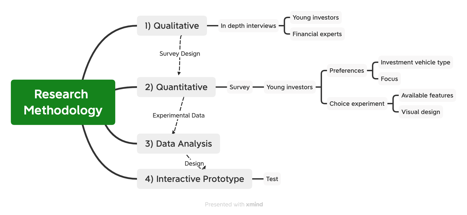
Expert interviews, a 63-question survey and real shopping sessions came before the interface decisions.
01
Frame the system
Reviewed sustainability, finance and purchasing behaviour with seven experts.
Literature review + 7 expert interviews
02
Map the people
Ran a 63-question mobile survey, with 876 eligible final responses.
1,644 starts + 986 completions + 876 eligible responses
03
Test in context
Tested the Chrome extension on Momo product pages in 32 moderated sessions.
32 moderated sessions + 100+ anonymous self-tests
Understand the product, company, materials, origin, and alternatives.
See how repeated choices shape money, resources, risk, and personal impact.
Recognize spending as support for the companies and systems behind the product.
The product thesis
Shopping can become the first lesson in investing.
Green Filter calls this “Shopping-as-Investing.” The phrase reframes a purchase as more than consumption. Purchasing directs money to companies and supply chains, but it is not the same as owning shares or changing policy. The prototype used that connection to ask what buyers can see and how much power a single transaction really gives them.
Behavioral segmentation
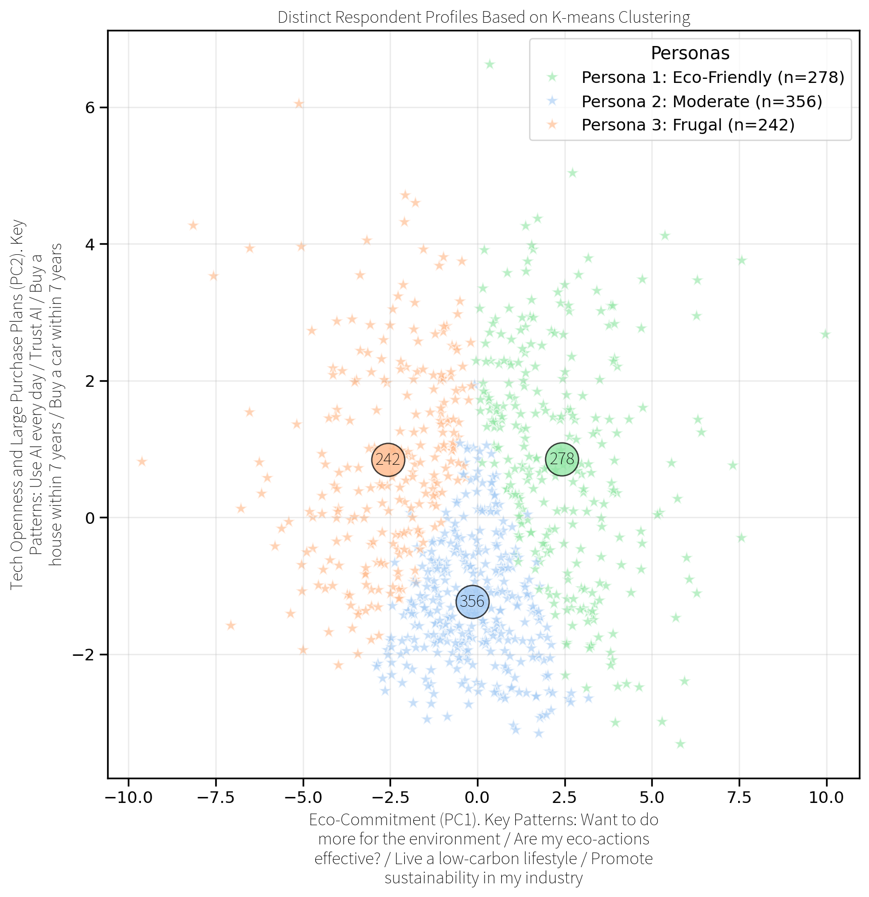
K-means clustering revealed three distinct shopping attitudes.
Values-led
n=278Product implication: Offer depth, provenance, and the ability to compare impact without hiding practical product quality.
Undecided
n=356Product implication: Make the better choice easy to understand, easy to compare, and compatible with price and convenience.
Cost-first
n=242Product implication: Lead with total value, durability, safety, savings, and lower-impact alternatives at a realistic price.
What students asked for
63%
41%
40%
25%
One project, four surfaces
01
Public research archive
The complete thesis became a navigable public website rather than a PDF hidden in a university repository. Methods, charts, quotes, testing notes, limitations, and conclusions remain open for inspection.
Explore the research02
Survey and recruitment environment
A Traditional Chinese entry point explained the research, collected anonymous student responses, and supported field recruitment across Taiwanese universities.
Visit Ziran Taiwan03
In-context intervention
The extension inserted product analysis into Momo, close to a real purchase decision. It surfaced sustainability signals, company context, and alternative products without requiring the user to start from a separate research tool.
View the extension04
Conversational exploration
The web prototype allowed deeper questions after the first signal: ingredients, materials, carbon, labor, company behavior, alternatives, and the relationship between spending and investing.
Open the AI prototypeInteraction design decisions
Testing changed what appeared first, how evidence was explained, and whether the interface offered a possible action.
01
Placement
In real shopping journeys, price, photography, and reviews drew attention first. The browser extension needed to enter that existing hierarchy instead of sending people away to read a report.
02
Language
An ESG label alone did not tell participants what they needed to know. A useful summary had to connect materials, production, labor, and environmental claims to sources that could be checked.
03
Agency
Participants found comparable alternatives more actionable than a warning on its own. Price, availability, safety, and practical product quality remained part of the ecological decision.
04
AI's role
The prototype used conversation for deeper questions. The more useful starting point was a concise explanation in context, with a path back to the underlying information.
What testing changed
ESG terms confused participants. Some mistook the interface for an ad.
Price, photos, reviews, and specifications took attention first.
Sustainability cannot expect a separate attention budget. It must work with the hierarchy of commerce.
Move the signal beside the price and connect greener choices to cost, quality, and availability.
The extension was sometimes missed or mistaken for an advertisement.
An intervention can technically exist on the page while remaining behaviorally invisible.
Clarify ownership, use a recognizable entry cue, and make the first benefit visible without an extra click.
ESG labels were recognized but poorly understood.
Institutional language can signal importance while failing to support a decision.
Replace jargon with a plain statement, a visual level, and a short explanation of the evidence.
Concrete alternatives were the most actionable feature.
People can act when the product preserves choice instead of ending with a warning.
Keep one-click alternatives persistent and compare the practical attributes that already matter.
Carbon, labor, ingredients, and disposal information created surprise.
Hidden product histories can change how familiar objects are understood.
Reveal one material fact at a time, then allow the user to inspect the full lifecycle and sources.
Outcome and limits
The extension and research are public. Spending changes remain unmeasured.
What the project established
Students already understood that money has environmental consequences. The missing layer was practical control: trustworthy signals, comparisons, alternatives, and an interface that arrives before the purchase is complete. The project reframed sustainability from a moral lecture into product intelligence that can support agency.
What remains open
A production system still needs reliable product passports, source provenance, data freshness, uncertainty handling, platform partnerships, mobile integration, and governance against greenwashing. These are product and institutional problems, not details an interface can hide.
Primary project sources
A conversation beyond the prototype
Optional analytics. Google Analytics and Clarity load only if allowed; form, email, and chat content are excluded.